
Synopsis of Wine Analysis
I completed this project through Udacity’s Data Analyst Nanodegree. I really enjoyed the nanodegree and look forward to taking my next one, whenever that may be.
If you would like to see the code of my analysis, it will be available here.
This is just a brief synopsis of my exploratory data analysis of white wine. The full analysis was completed in RStudio.
About the Data
The data was provided by Udacity for the exploratory data analysis project. Our data are variants of “Vinho Verde”, a Portuguese white wine.
We have over 4,800 samples of wine for this dataset. Our predictor variables are chemical qualities and our response variable is sensory data (median of at least 3 evaluations made by wine experts). Each expert graded the wine quality between 0 (very bad) and 10 (very excellent). The following is a list of the variables: fixed acidity, volatile acidity, citric acid, residual sugar, chlorides, free sulfur dioxide, total sulfur dioxide, density, pH, sulphates, and alcohol.
Univariate Analysis
To begin, I looked at the distribution of each variable. Most of the variables have approximately normal distributions with a few outliers, except for residual sugar. Residual sugar was positively skewed.
I created a few variables during this analysis. I created a variable from quality, which was just to decrease the granularity of the data. I figured it would just make it easier to see the general patterns of the data. I also created a variable, called bound sulfur dioxide. It was essentially just the difference between total sulfur dioxide and free sulfur dioxide.
Bivariate Analysis
To start, I created a scatterplot matrix of all the continuous (ratio) variables, which can be seen below:
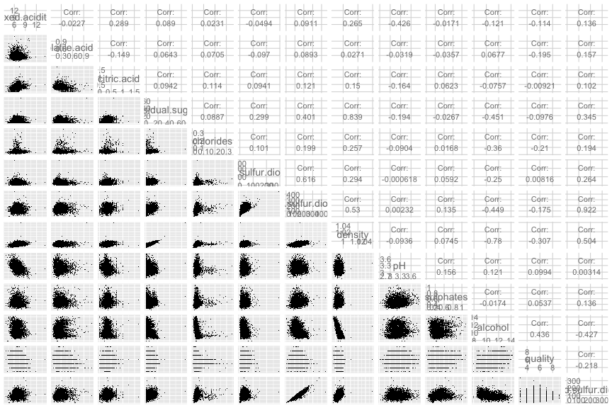
From this plot, I created a chart that notes all the meaningful relationships between variables. I consider meaningful relationships to be one where the absolute value of the correlation coefficient is greater than 0.3 I have pasted the chart below:
Meaningful Relationships between Indicator Variables
| Variable | Variable | Correlation | ||||
|---|---|---|---|---|---|---|
| residual sugar | total sulfur dioxide | 0.401 | ||||
| free sulfur dioxide | total sulfur dioxide | 0.616 | ||||
| residual sugar | density | 0.839 | ||||
| fixed acidity | pH | -0.426 | ||||
| total sulfur dioxide | density | 0.53 | ||||
| residual sugar | bound sulfur dioxide | 0.345 | ||||
| total sulfur dioxide | bound sulfur dioxide | 0.922 | ||||
| density | bound sulfur dioxide | 0.504 | ||||
| alcohol | bound sulfur dioxide | -0.427 | ||||
| residual sugar | alcohol | -0.451 | ||||
| chlorides | alcohol | -0.36 | ||||
| total sulfur dioxide | alcohol | -0.449 | ||||
| density | alcohol | -0.78 |
A lot of these correlation coefficients make sense. The largest correlation coefficient in our chart is between total sulfur dioxide and bound sulfur dioxide with a value of 0.922. Bound sulfur dioxide and total sulfur dioxide are colinear, remember that I created the bound sulfur dioxide variable from the total sulfur dioxide and free sulfur dioxide. The next highest correlation coefficients are for residual sugar and density with a value of 0.839, and alcohol and density with a value of -0.78. I explain these relationships more down below.
Meaningful Quality Predictor Variables
Ordinal variables require use of Spearman’s rank correlation coefficient (rho). This test was run with every variable. Meaningful quality predictor variables are on the chart below. A meaningful relationship is one with a rank correlation coefficient greater than 0.3.
| Variable | Correlation | ||
|---|---|---|---|
| chlorides | -0.31449 | ||
| density | -0.34835 | ||
| alcohol | 0.44037 |
The relationship between quality and alcohol can be seen more clearly below:
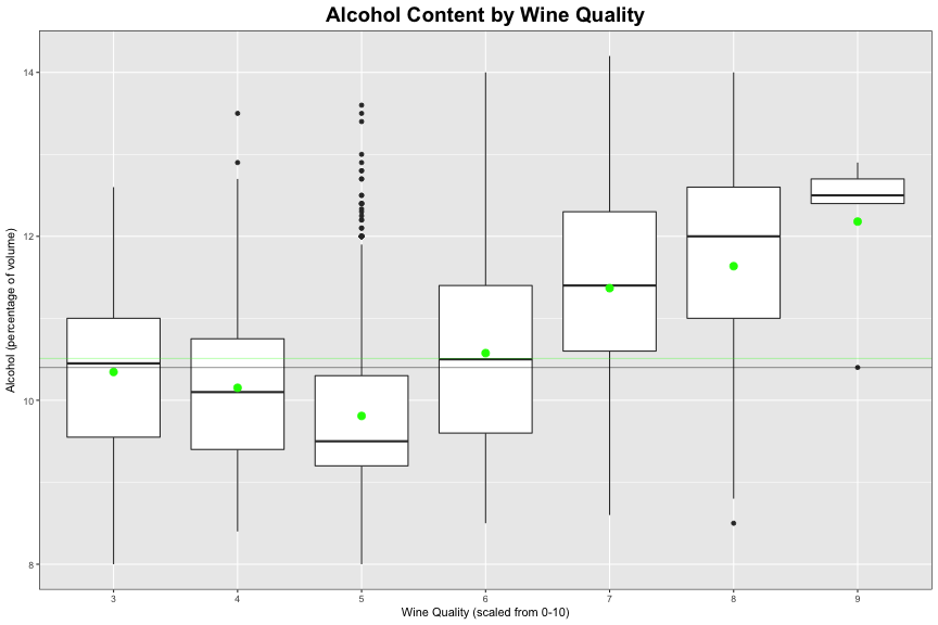
The green dots on each boxplot are the mean alcohol content for each quality of wine. The faint horizontal green line on the plot is the mean alcohol content for the entire dataset, which is 10.51. The faint black line on the plot is the median alcohol content for the entire dataset, which is 10.4.
The most influential variable when it comes to the quality of wine, is the percentage of alcohol in the wine, with a correlation coefficient of 0.44. This trend is the definitely apparent for all qualities of wine, but is strongest for wines with qualities from 5 to 9. Higher quality wines tend to have higher alcohol values.
Perhaps it is easier to make stronger wine a better quality because there is a widers the range for other variables to be considered a good quality wine. I’d argue the stronger a wine, the harder it is for the taster to differentiate the other factors of the wine apart. Perhaps better quality wines have also been aged for longer, hence more alcohol.
As seen on the above plot, the alcohol and quality trend is more apparent for higher quality wines. This could be due to the sample, meaning lower quality wines typically do have less alcohol just not for the samples we have. There must be some other trend going on. I’d be interested to investigate a dataset where there is a higher frequency of lower and high quality wines.
Multivariate Analysis
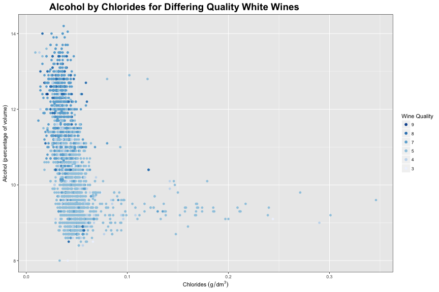
Wines with a quality of 6 were removed from this plot to reduce overplotting and to better differentiate the trends between the wine quality.
In this plot, we can see the relationship between alcohol and chlorides and how they both relate to quality. Wines with less alcohol, and more chlorides tend to be of a poorer quality. While wines with more alcohol and less chlorides tend to be of a poorer quality. There is a greater variance in chloride content for wines with lower alcohol content.
Salt blocks the bitter receptors on our tongues. You can read more about that here. I’d guess that when you make a wine that ends up being too bitter, you can add a little bit of salt to hide the bitter taste. That bitter wine, and wine that has had it’s bitterness covered up with salt, still isn’t good. I’d guess that adding salt almost treats the symptoms of the bitterness but it doesn’t fix the fact the the wine is bitter. Which might have an effect on the overall taste or quality.
The less alcohol in the wine, the greater the variance in the density of the wine. I’d guess wines with lower alcohol contents tend to have more issues during fermentation, which could cause bitter wine, which would require a little bit of salt to cover it up.
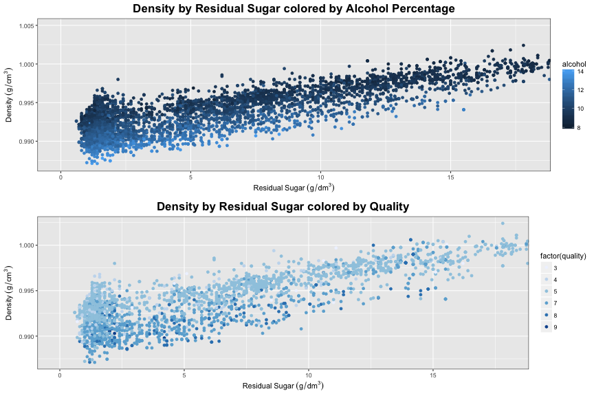
Of all of the variables compared with eachother, density and residual sugar have the strongest coefficient with a value of 0.839. Our first plot visualizes this strong relationship, quite nicely. The beautiful alcohol color gradient on this same plot nicely shows that most density variations are due to alcohol content. When you look at a vertical slice of this top plot, we look at wines with similar levels of residual sugar content. For this vertical slice, our color gradient proves that variations in density are due to differing alcohol content. This makes sense, when consdering the density of alcohol and residual sugar. The density of sugar (glucose) is 1.54 g/cm^3^, the density of water is 1.00g/cm^3^ and the density of alcohol (ethanol) is 0.789. Our color gradient turns darker towards the end of our plot, meaning less alcohol.
Wines with a a quality of 6 were removed from our density and residual sugar plot to reduce overplotting. In our second plot there seems to be to a interesting color gradient that shows that wines with less residual sugar and lower densities tend are usually better quality. This does correspond with where the higher alcohol contents are on the previous graph.
There is a region (wines with residual sugar greater than 10 g/dm^3^) where there is varying qualities of wine, which don’t seem to be explained by alcohol content.
If I were to investigate more into this, I would like to investigate what differentiates the quality in a low alcohol wine. I think I would have to subset the data and look into all of the variables again. I think it would be interesting to have more even-classed dataset. More low and high quality wines to better visualize these trends. In addition to that I think it would be interesting to see the price of the wine too, I feel I have read somewhere that certain moderately priced wines can be of the same quality as the more expensive wines.
I also believe there was a twin dataset to this one for red wines. It would definitely be interesting to see the difference between the two dataset. Perhaps, using a classifier algorithm.
If you have any questions or comments please do not hesistate to contact me: dana.cody.sn@gmail.com